Introduction
In the world of technical analysis, candlestick charts stand tall as one of the most popular and visually captivating tools used by traders and investors. Originating in Japan during the 17th century, candlestick charts have transcended time and borders, becoming an integral part of the financial markets worldwide. If you’re new to the world of candlestick charts, fear not! In this blog, we’ll unravel the basics of candlestick charts, exploring their history, structure, and how they represent price movements, empowering you to navigate the markets with greater insight and confidence.
What are Candlestick Charts?
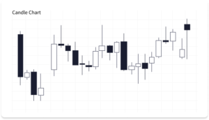
At its core, a candlestick chart is a graphical representation of price movements over a specific period of time. Each candlestick captures the opening, closing, highest, and lowest prices within the chosen timeframe, making it an invaluable tool for analyzing market sentiment and potential trends.
The Anatomy of a Candlestick
A single candlestick consists of two main components: the body and the wicks (also known as shadows or tails). The body of the candlestick is the rectangular area between the opening and closing prices. If the closing price is higher than the opening price, the body is usually colored green or white, indicating a bullish candle. Conversely, if the closing price is lower than the opening price, the body is typically colored red or black, signifying a bearish candle.
The Wicks
The wicks, which extend from the top and bottom of the body, represent the highest and lowest prices reached during the specified period. They provide critical information about the price range and volatility of the asset in question. Longer wicks suggest increased volatility, while shorter wicks indicate relatively stable price movement.
Interpreting Candlestick Patterns
The true power of candlestick charts lies in their ability to form various patterns based on the arrangement of individual candles. These patterns can provide valuable insights into potential market movements and help traders make more informed decisions. Some commonly recognized candlestick patterns include:
- Doji: A doji occurs when the opening and closing prices are nearly identical, creating a short or non-existent body. It suggests market indecision and often precedes trend reversals.
- Hammer and Hanging Man: These are single candlestick patterns with a small body and a long lower wick. A hammer occurs after a downtrend and indicates a potential trend reversal, while a hanging man occurs after an uptrend and may signal a bearish reversal.
- Bullish Engulfing and Bearish Engulfing: Engulfing patterns involve two candles and occur when the body of the second candle entirely engulfs the body of the preceding candle. A bullish engulfing signals a potential bullish reversal, while a bearish engulfing suggests a bearish reversal.
Conclusion
Candlestick charts are a treasure trove of information for traders and investors, providing visual cues about market sentiment and potential price movements. By understanding the basics of candlestick charts and recognizing common patterns, you can gain a competitive edge in the financial markets. As you delve deeper into technical analysis, keep in mind that combining candlestick analysis with other indicators and risk management strategies is key to successful trading. Now that you’ve grasped the fundamentals of candlestick charts, dive in and explore the fascinating world of technical analysis! Happy charting!